
Side menu
 The guideline content on this page is synced with Figma and can be used as a source of truth.
Open in Figma
The guideline content on this page is synced with Figma and can be used as a source of truth.
Open in Figma
Side menu is a vertical, hierarchical navigation component that appears on the left side of a page or screen.
Anatomy
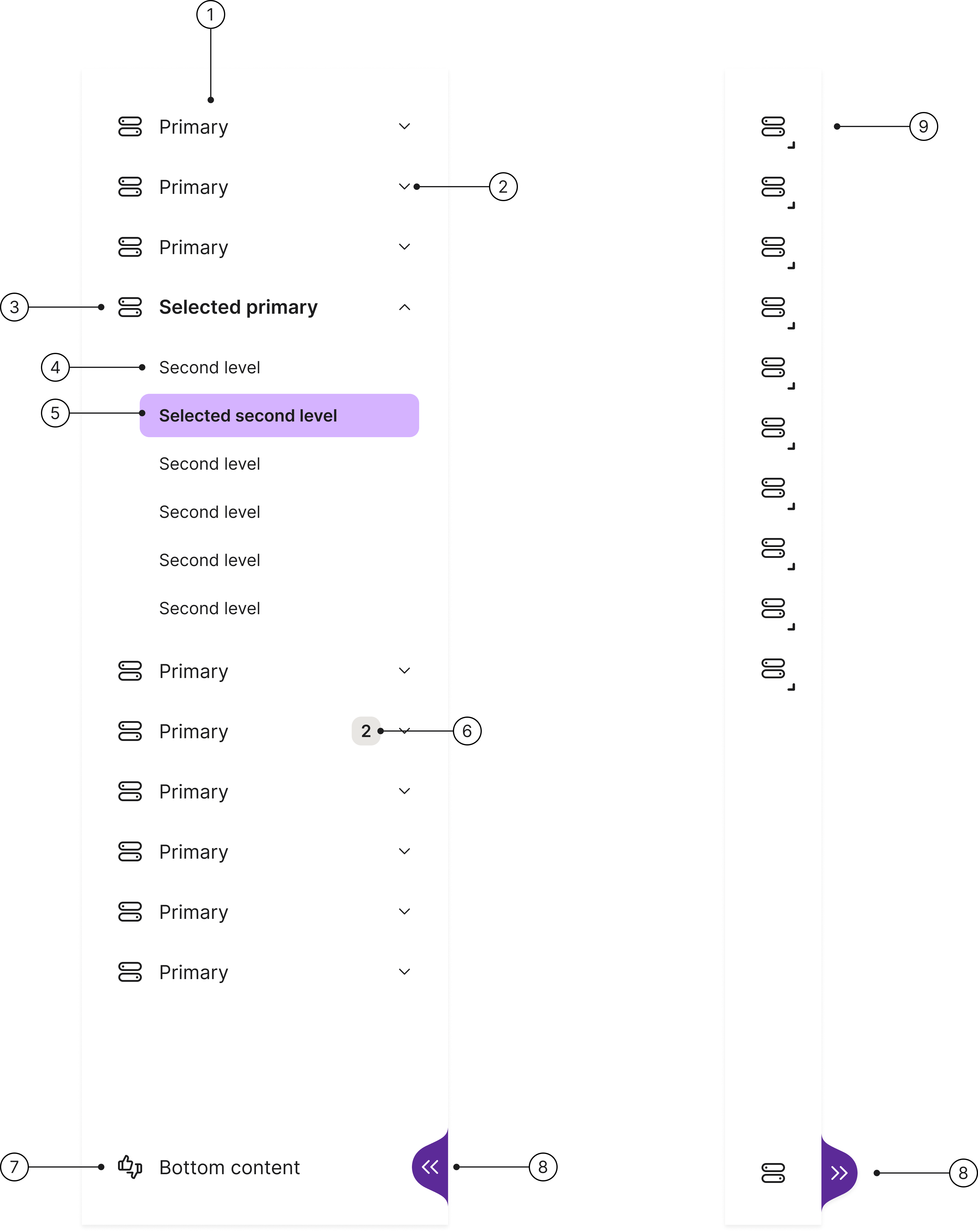
- Navigation in its expanded state
- Dropdown icon: only shown when there is more content in a sub-menu
- Primary level expanded
- Second level
- Second level selected
- Badge
- Bottom content
- Chevron to collapse and expand navigation
- Navigation in its collapsible view
States
The top-level menu item supports the following states:
- Enabled
- Hover
- Selected
- Focused
- Pressed
Accessibility
Keyboard interaction
All components should be reachable via TAB and SHIFT+TAB keys.
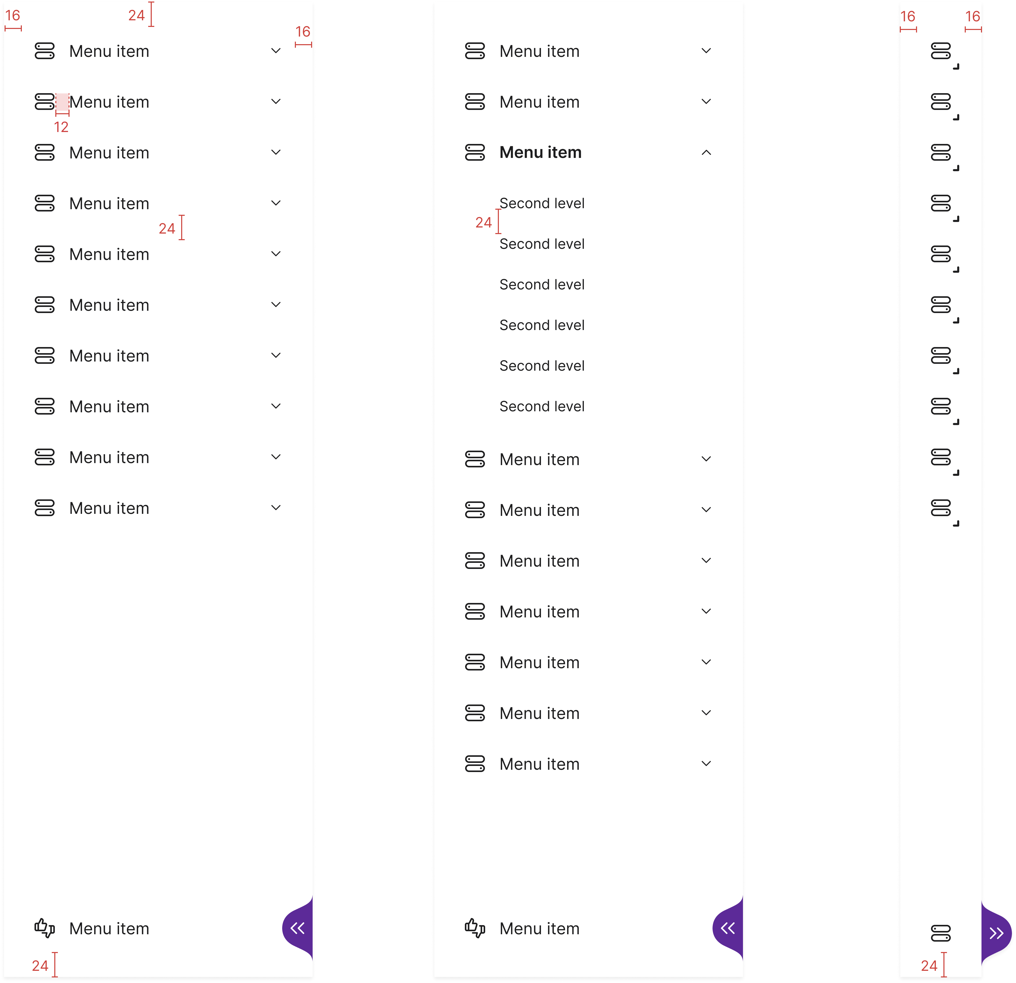
Specs
Developer reference
The following sections describe the supported markup and interactive variants. By default the menu collapses and expands responsively through CSS media queries alone — that part needs no JavaScript. JavaScript is still required for sub-menu expansion and for the show / hide handle (.show-nav) wherever it appears — including on a responsive menu, not only on the static opt-in variant. The snippets below include the inline script that powers those demonstrations.
Responsive collapse
The side menu is responsive by default: it collapses and expands with the viewport through CSS media queries alone — no opt-in class and no resize listener are required. Pair .vertical-nav-collapse with .vertical-nav-icons on a .vertical-nav menu and use a plain .page-holder on the content wrapper.
To keep the previous JavaScript-driven show / hide menu instead — one that stays at a fixed width until your script toggles it — opt out with .vertical-nav-static on the menu and .page-holder-static on the wrapper (see Static show / hide below).
Breakpoints
The thresholds track the design-system $screen-* variables rather than one-off pixel values, so the menu follows the same grid as the rest of the library. 1280px ($screen-lg-min) is the single decisive point at which the menu toggles between its expanded and collapsed presentation.
Below 768px the collapsed icon strip stays visible, overlaying the content; the responsive default never slides the menu off-canvas. Fully hiding the menu is a static-menu behaviour — the JavaScript-driven .show-nav handle toggling .hidden-menu on a non-.vertical-nav-collapse menu — not something the responsive collapse provides.
| Viewport width | Menu state | Content offset |
|---|---|---|
≥ 1280px ($screen-lg-min) |
Expanded — full text labels, sub-menus render inline | Full width (304px) |
| 992px – 1279px | Collapsed icon strip — sub-menus open as pop-outs to the right | Collapsed width (80px) |
≤ 991px ($screen-md-max) |
Collapsed icon strip, overlaying the content | None — strip overlays content |
Example
The preview below renders inside a fixed-width frame, so it shows the expanded state; resize the browser window across 1280px to watch the menu collapse to its icon strip. Responsive collapse needs no extra class — a plain .page-holder wrapping a .vertical-nav.vertical-nav-collapse.vertical-nav-icons menu is enough. This example also keeps the optional .show-nav handle, so it adds .page-holder-nav-collapse to the wrapper: that keeps the reserved content offset matched to the 80 px strip when the handle collapses the menu at desktop widths (≥ 1280 px), instead of leaving a gap. Drop the handle (or add .vertical-nav-no-toggle) if you do not need manual collapse.
For a full-viewport version you can resize directly — shown with the handle hidden via .vertical-nav-no-toggle — open the responsive side menu demo page.
Hide the collapse handle
Add .vertical-nav-no-toggle to the menu to fully hide the show / hide chevron handle. This suits a responsive menu that is driven entirely by the viewport, where a manual collapse control is unnecessary. The handle is removed from both the layout and the accessibility tree.
For a full-viewport version, open the responsive side menu demo page — it pairs the responsive default with .vertical-nav-no-toggle and you can resize the window directly.
Static show / hide
These variants keep the previous behaviour, where the menu stays at a fixed width until your JavaScript toggles it. To opt back into it, add .vertical-nav-static to the menu and .page-holder-static to the content wrapper — without those classes the menu is responsive by default (see Responsive collapse above). Every example in this section includes the opt-out pair.
Collapsed view
The collapsed icon-only view is produced by pairing .vertical-nav-icons with .vertical-nav-collapse on the wrapper and adding .hidden-menu to render the menu in its 80 px collapsed state. The example below renders the menu in its collapsed view by default.
Hide / show, no icons
To hide / close the navigation, apply the .hidden-menu class to the main vertical navigation wrapper (.vertical-nav) and, if necessary, the .hidden-vert-menu class (or your own functional class) to the page main content (.page-holder) so the layout responds to the new width.
Pellentesque a nibh nec risus posuere ultrices in sit amet eros. Donec pulvinar ipsum orci, a imperdiet mi facilisis id. Nunc mattis, ligula vitae facilisis facilisis, libero turpis fermentum metus, in maximus sapien velit in enim. Proin dapibus posuere consectetur. Nunc vitae libero vitae purus tempor us a ut orci.
Partial collapse, no icons
To contract / shrink the width instead of hiding the navigation list, add the .vertical-nav-collapse class to the wrapper. When the .hidden-menu class is applied, the menu contracts rather than disappears.
Pellentesque a nibh nec risus posuere ultrices in sit amet eros. Donec pulvinar ipsum orci, a imperdiet mi facilisis id. Nunc mattis, ligula vitae facilisis facilisis, libero turpis fermentum metus, in maximus sapien velit in enim. Proin dapibus posuere consectetur. Nunc vitae libero vitae purus tempor us a ut orci.
Hide / show, with icons
Add the .vertical-nav-icons class to the wrapper to render menu items with a leading icon.
Pellentesque a nibh nec risus posuere ultrices in sit amet eros. Donec pulvinar ipsum orci, a imperdiet mi facilisis id. Nunc mattis, ligula vitae facilisis facilisis, libero turpis fermentum metus, in maximus sapien velit in enim. Proin dapibus posuere consectetur. Nunc vitae libero vitae purus tempor us a ut orci.
Partial collapse, with icons
Combine .vertical-nav-collapse with .vertical-nav-icons to render the icon-only collapsed strip alongside the contractible expanded view.
Pellentesque a nibh nec risus posuere ultrices in sit amet eros. Donec pulvinar ipsum orci, a imperdiet mi facilisis id. Nunc mattis, ligula vitae facilisis facilisis, libero turpis fermentum metus, in maximus sapien velit in enim. Proin dapibus posuere consectetur. Nunc vitae libero vitae purus tempor us a ut orci.
With variant badges
Add .badge or .badge-info / .badge-success / .badge-warning / .badge-danger elements inside the menu item link to render notification counts.
Pellentesque a nibh nec risus posuere ultrices in sit amet eros. Donec pulvinar ipsum orci, a imperdiet mi facilisis id. Nunc mattis, ligula vitae facilisis facilisis, libero turpis fermentum metus, in maximus sapien velit in enim. Proin dapibus posuere consectetur. Nunc vitae libero vitae purus tempor us a ut orci.