Header Breaking changenavigation, top, menu, top navigation, navbar, nav bar, navigation bar, second level, 2-level menu, sub navigation, Skatt & Bokslut
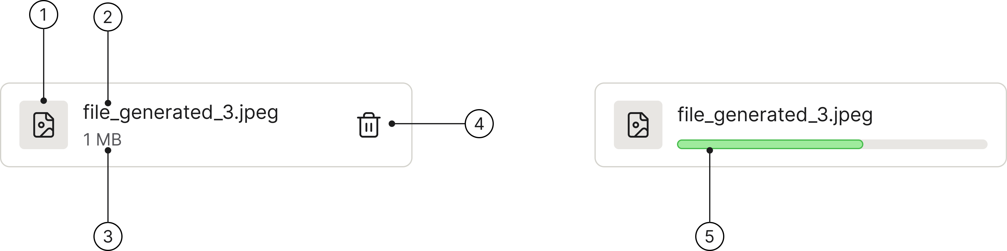
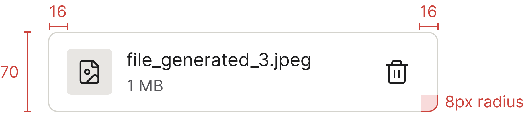
File information is typically displayed directly below the Upload component immediately after the user interacts with it — either by selecting a file or once the upload is complete.
<divclass="docs-file-usage"><divclass="drop-area"id="file-usage-upload"><inputtype="file"id="file-usage-upload-input"class="drop-area-input"aria-label="Upload files"><labelfor="file-usage-upload-input"class="drop-area-upload">Upload files</label><divclass="drop-area-content"><spanaria-hidden="true"class="spirisicon spirisicon-upload"></span><divclass="drop-area-section"><pclass="drop-area-heading">Drag and drop or <spanclass="drop-area-link">click to upload</span></p><pclass="drop-area-description">SVG, PNG, JPG or GIF (max 500mb)</p></div></div></div><divclass="file"id="file-usage-file"tabindex="0"role="group"aria-label="file_generated_3.jpeg"><divclass="file-content"><divclass="file-icon"><spanaria-hidden="true"class="spirisicon spirisicon-file-image"></span></div><divclass="file-meta"><pclass="file-name">file_generated_3.jpeg</p><pclass="file-description">1 MB</p></div></div><buttontype="button"class="btn btn-icon btn-lg"aria-label="Remove file"><spanaria-hidden="true"class="spirisicon spirisicon-delete"></span></button></div></div>
Hover icon
When hovering an icon, apply the same hover state styling used for our Icon Buttons. While the icon size may vary, the hover effect must remain consistent.
Accessibility
Keyboard interaction
The whole file row is reachable via TAB and SHIFT+TAB — focus lands on the row first, then on the trash icon (or any action button inside it). A focused row shows a blue keyboard-focus ring.

 The guideline content on this page is synced with Figma and can be used as a source of truth.
Open in Figma
The guideline content on this page is synced with Figma and can be used as a source of truth.
Open in Figma