
Accordion
 The guideline content on this page is synced with Figma and can be used as a source of truth.
Open in Figma
The guideline content on this page is synced with Figma and can be used as a source of truth.
Open in Figma
An accordion helps you show and hide content. When you press the icon, it expands to reveal more information or collapses to hide it.
Anatomy
- Title
- Button icon
- Content
- Divider
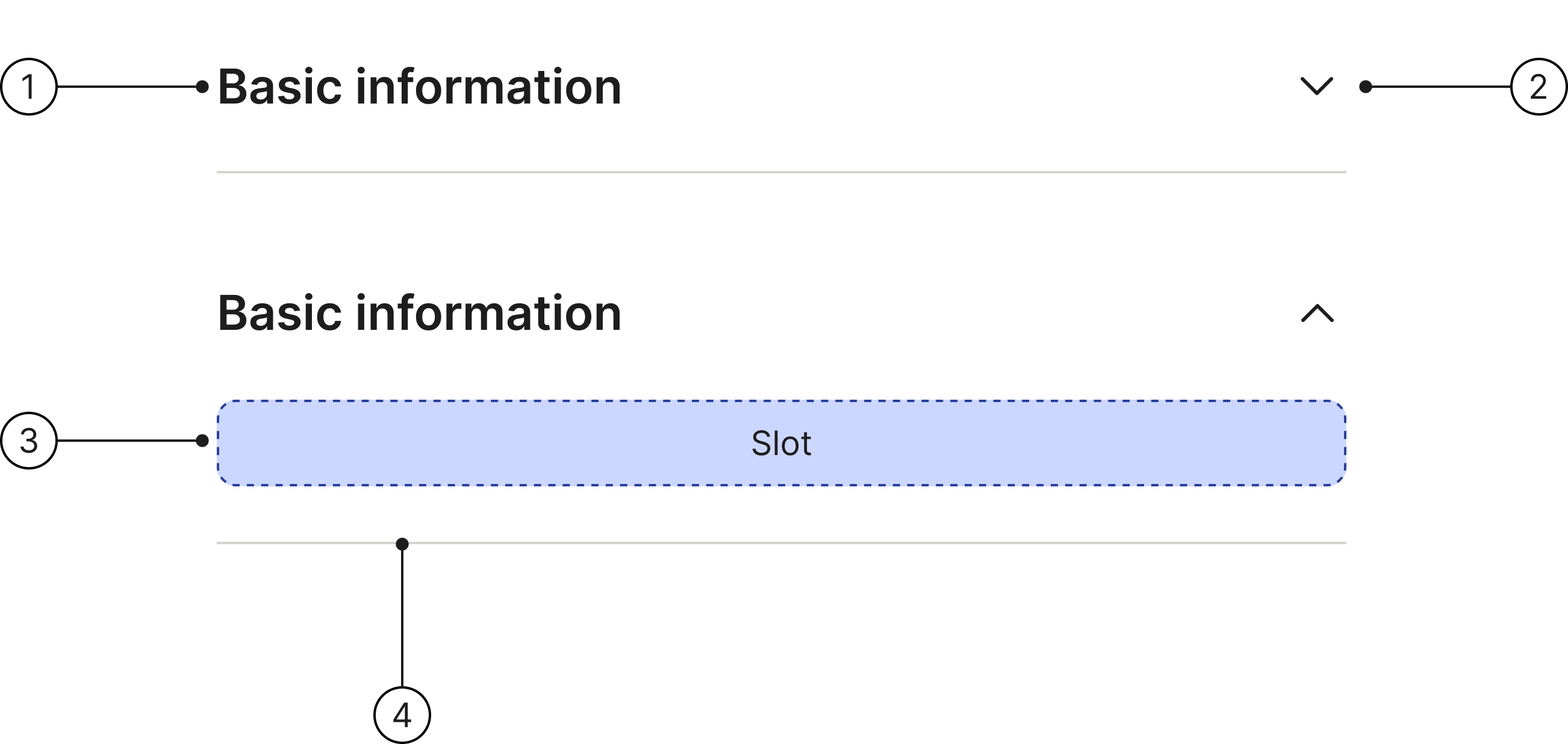
Title
The title describes the content a row can reveal. Titles can wrap to multiple lines if needed, but it is best to keep them concise.
Basic information
Content
The content area of an accordion row can include text, images, or other components. The accordion height will flex to fit various types of content.
For paragraph text, keep the line length between 40–75 characters (counting both letters and spaces).
Basic information
Divider
Dividers are shown between accordion rows to aid visual clarity.

Accessibility
Keyboard interaction
All components should be reachable via TAB and SHIFT+TAB keys.
Basic information
Behaviour
Expand/Collapse
When using an accordion, you can expand or collapse any given row by clicking on any part of it, including the title or icon button. The icon will change to show whether the row is open or closed. Rows stay open until you close them yourself.
Basic information
Expand or collapse this row by clicking anywhere on the header — the title, the icon, or the surrounding space. The icon flips to show whether the row is open or closed.
Clickable area
By making the entire field — including the label, icon, and any surrounding space — clickable, you significantly increase the target area for users. This is especially beneficial on touch devices or for users with motor impairments, as it requires less precision to expand or collapse the section. Instead of having to click a small icon, a user can simply tap or click anywhere on the row to get the desired result. This reduces user frustration and makes the interface feel more responsive.

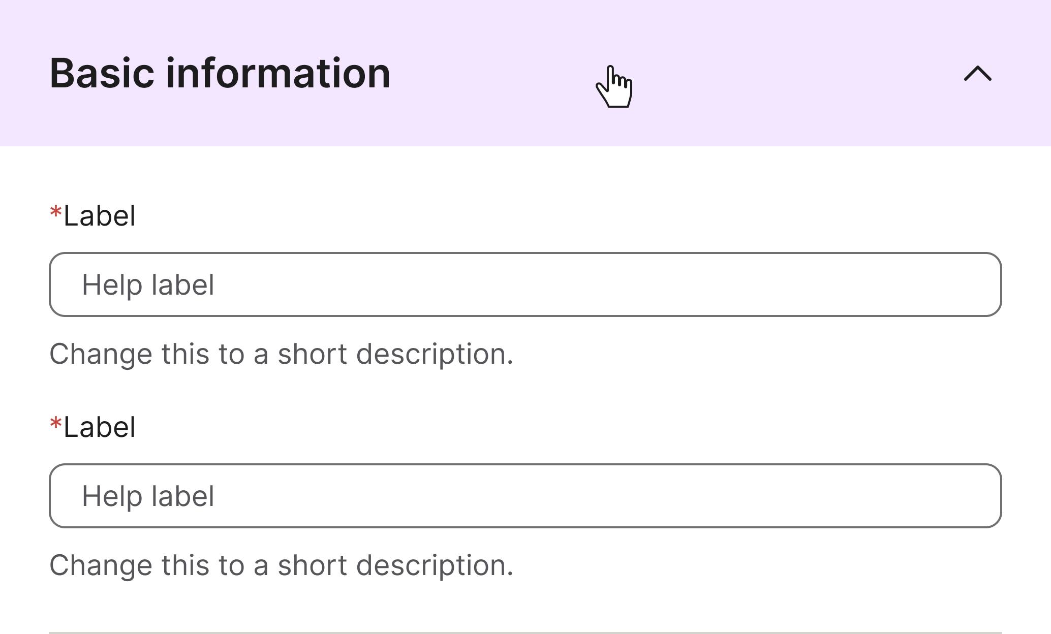
Hover
When the user hovers on the accordion the background colour will change to surface/hover.

Hover for accordion open
When the user hovers on the accordion in an expanded state the background colour will change to surface/hover. The area in which the background colour changes is the same as the default state.
Best practices
Title
Basic information

Keep this title short. Only add more text if it is necessary to clarify the expected content.
Basic information about the customer, including contact and billing details

Don’t use long titles.
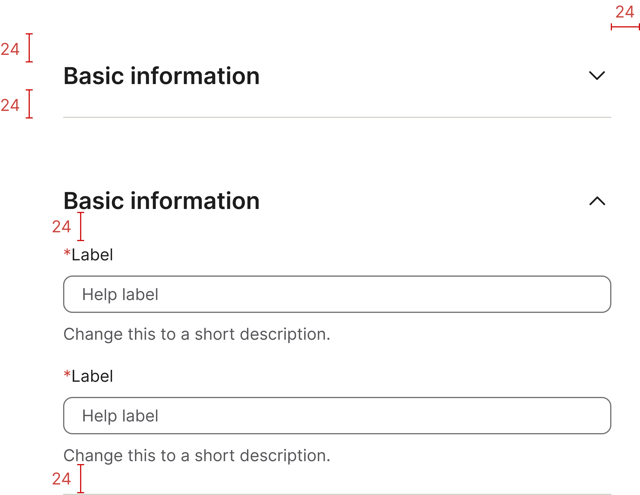
Specs
Developer reference
The following sections describe supported markup and patterns that are not part of the Figma design specification.
Collapsible lists/accordion, without script
Collapsible lists, or accordions, using <details> and <summary> combo.
With new .collapse-list class.
Title
Collapsible lists/accordion, with script
For this variant component you need JavaScript! We recommend to create your own scripts following the structure from the examples below.
You can also use the scripts we use for our examples.
With new .collapse-list class.
Collapsible lists/accordion, with multilevels
With new .collapse-list class, using <details> and <summary> combo.
Dividers (hr.divider) are only supported at the first level — place them as siblings between and after <details> elements inside .group-list.
Title 1
Title 1-1
Title 1-2
Title 1-3
Title 1-4
Title 1-5
Title 2
Title 2-1
Title 2-2
Title 2-3
Title 3
Title 3-1
Title 3-2
Title 3-3
Title 3-4
Title 4
Title 4-1
Title 4-2
With new .collapse-list structure (divs).
Dividers (hr.divider) are only supported at the first level — place them as siblings between and after .collapse-list elements inside .group-list.
For this variant component you need JavaScript! We recommend to create your own scripts following the structure from the examples below.