
Alert
 The guideline content on this page is synced with Figma and can be used as a source of truth.
Open in Figma
The guideline content on this page is synced with Figma and can be used as a source of truth.
Open in Figma
An alert gives users important information about their current task, without them having to leave the screen.
Anatomy
- Container
- Icon
- Body content
- Close (optional)

Types of alert
You have four types to choose from: success, information, warning and error. Pick the one that best fits the message you're trying to convey.
Please keep in mind that the icons for these message types can't be changed.
- Success
- Info
- Warning
- Error
Success .alert-success
Alert title
You've confirmed [email protected]. You're all ready to start a new group for your team.
Info .alert-info
Alert title
You've confirmed [email protected]. You're all ready to start a new group for your team.
Warning .alert-warning
Alert title
You've confirmed [email protected]. You're all ready to start a new group for your team.
Error .alert-danger
Alert title
You've confirmed [email protected]. You're all ready to start a new group for your team.
Link
We include the ability to add a link within an alert message because an alert by itself is often just the start of a conversation. The link transforms the alert from a passive notification into an actionable next step.
Alert with link
Alert title
You've confirmed [email protected]. You're all ready to start a new group for your team.
LinkTitle
A bolded title is optional. Use a title to quickly summarise the purpose of the notice. Keep titles short, no more than 60 characters, and avoid repeating the body text.

Dismiss
Alert notices can include a dismiss button that removes the notice from the page layout. This is helpful for general or supplemental information. The user needs to actively close the alert.

Close icon
The decision to hide the close icon should be deliberate and reserved only for alerts that represent a mandatory acknowledgement or a system-controlled status change. If the user can ignore the message, they must be given the option to dismiss it.
Alert title
You've confirmed [email protected]. You're all ready to start a new group for your team.
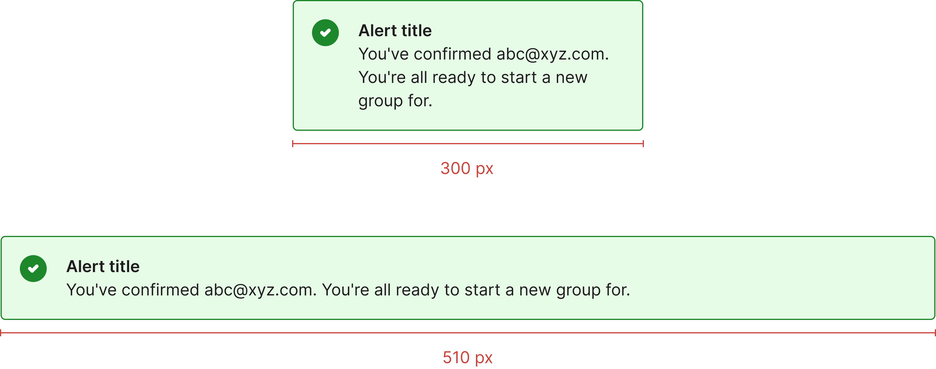
Max/min width
Having a defined max and min width for an alert is crucial for readability and visual consistency.
A minimum width ensures the alert's content isn't cramped and remains easy to read, whilst a maximum width prevents text lines from becoming too long, which can strain the user's eyes and make the message harder to scan.
Alerts have a minimum width of 300px and a maximum width of 800px.
Usage
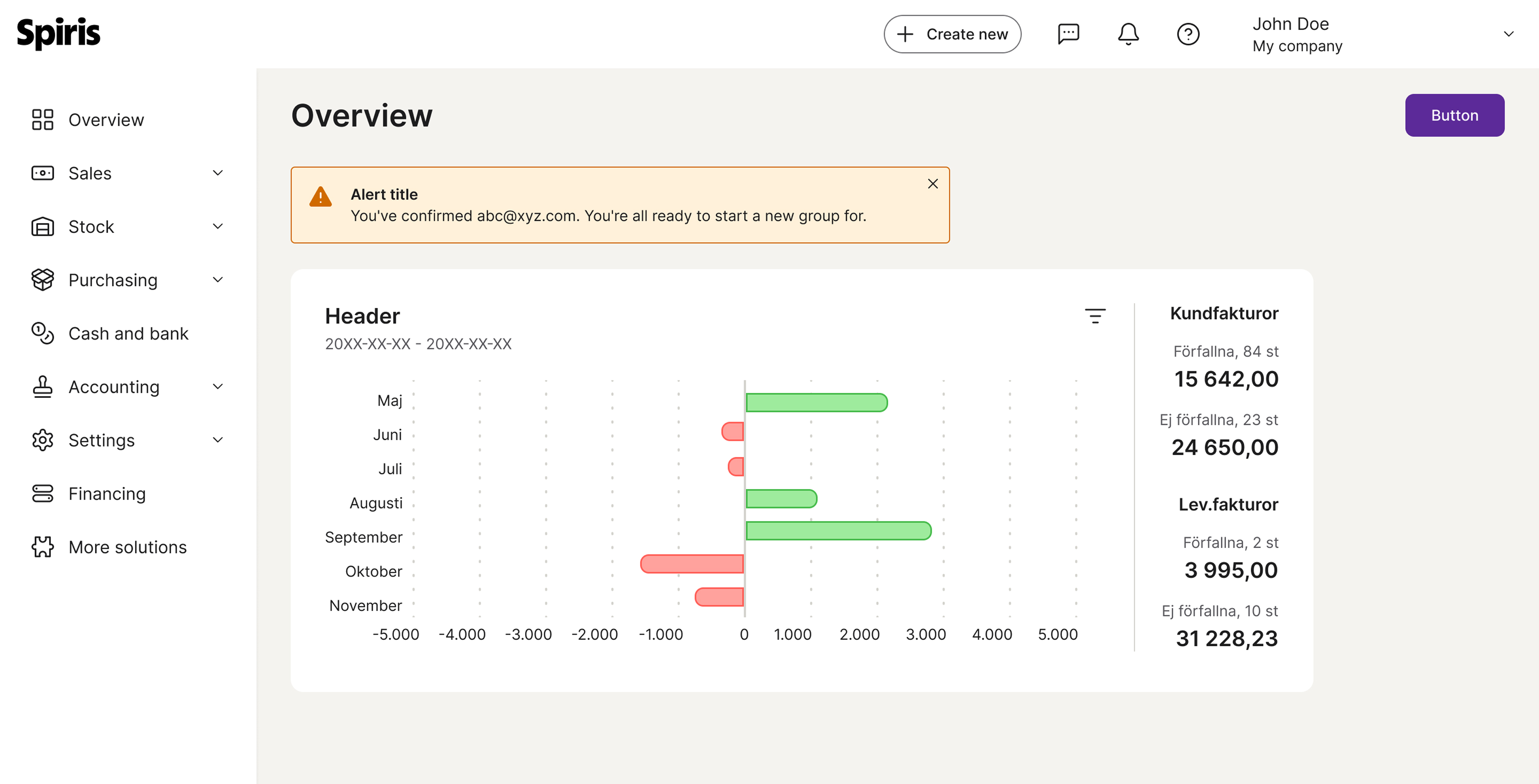
Placing alerts in the top middle of the screen is a best practice in a design system for visibility and user focus. This position is a prime location that ensures the message is seen without being overly intrusive.
Accessibility
Keyboard interaction
All components should be reachable via TAB and SHIFT+TAB keys.
The alert itself has no focus state and is not focusable, but any actions inside it are focusable and have their own focus state.
Alert title
You've confirmed [email protected]. You're all ready to start a new group for your team.
LinkBest practices
One alert at a time
Show only one alert at a time. Once a user dismisses or addresses it, replace it with the next most important notice. Avoid stacking alerts — they can quickly become overwhelming.
Alert title
You've confirmed [email protected]. You're all ready to start a new group for your team.

Show a single alert so the message stays clear and easy to act on.
Alert title
You've confirmed [email protected]. You're all ready to start a new group for your team.
Alert title
You've confirmed [email protected]. You're all ready to start a new group for your team.
Alert title
You've confirmed [email protected]. You're all ready to start a new group for your team.

Avoid stacking multiple alerts — they compete for attention and quickly become overwhelming.
Specs

Developer reference
The following sections describe supported functionality that is not part of the Figma design specification.
Options
Wrap any text and an optional dismiss button in .alert for a basic alert message.
To apply a type, add one of the following classes: .alert-success, .alert-info, .alert-warning or .alert-danger. .alert-error is kept as a legacy alias of .alert-danger — both produce identical output.
When no type class is applied, the alert uses the .alert-info appearance by default.
Success .alert-success
Alert title
You've confirmed [email protected]. You're all ready to start a new group for your team.
Dismiss button
Add .alert-dismissible to the alert and include a dismiss button. The dismiss button is the small Icon Button (.btn.btn-icon.btn-sm) with a spirisicon-close glyph and an aria-label="Close". This Icon Button replaces the .close helper class: .alert positions and spaces its dismiss control from .btn-icon, so a bare .close there is never positioned at all.
The Spiris package ships CSS only, so removing the alert from the page is the consumer's responsibility (see the example markup's data-dismiss="alert" hook).
Alert title
You've confirmed [email protected]. You're all ready to start a new group for your team.
Accessibility
Always use role="alert" on the alert container so the message is announced to screen readers.
The dismiss button must include aria-label="Close" for screen reader users.
The alert container is not focusable — only the interactive elements inside it (the dismiss button and any links) are keyboard-focusable, each with its own focus state.
Alert title
You've confirmed [email protected]. You're all ready to start a new group for your team.
LinkSmall alert
Add .alert-sm for a smaller, more compact alert.
Success .alert-success.alert-sm
Alert title
You've confirmed [email protected]. You're all ready to start a new group for your team.
Info .alert-info.alert-sm
Alert title
You've confirmed [email protected]. You're all ready to start a new group for your team.
Warning .alert-warning.alert-sm
Alert title
You've confirmed [email protected]. You're all ready to start a new group for your team.
Error .alert-danger.alert-sm
Alert title
You've confirmed [email protected]. You're all ready to start a new group for your team.